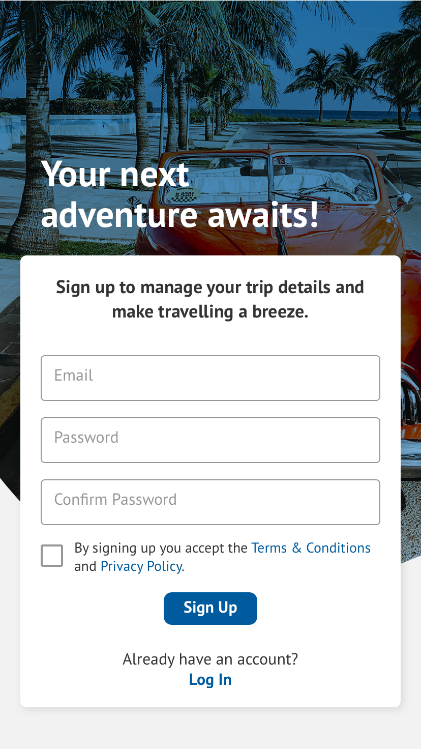
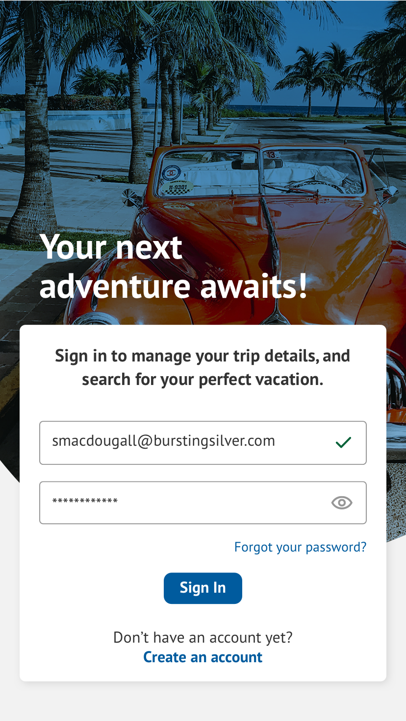
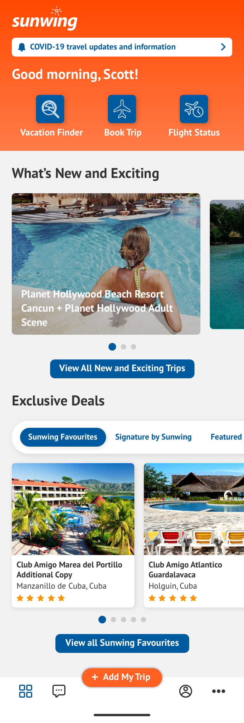
An updated experience that takes a user from pre to post-flight
Justine was contracted by Bursting Silver to create a new login/sign up page, and homepage for Sunwing’s App. Originally, the app had a lot of webview content which is what the client wanted to move away from. So the idea was to make the app ‘Home Screen’ centric. The following purposed concept design follows UX best practices providing a more intuitive experience for users.
Problem
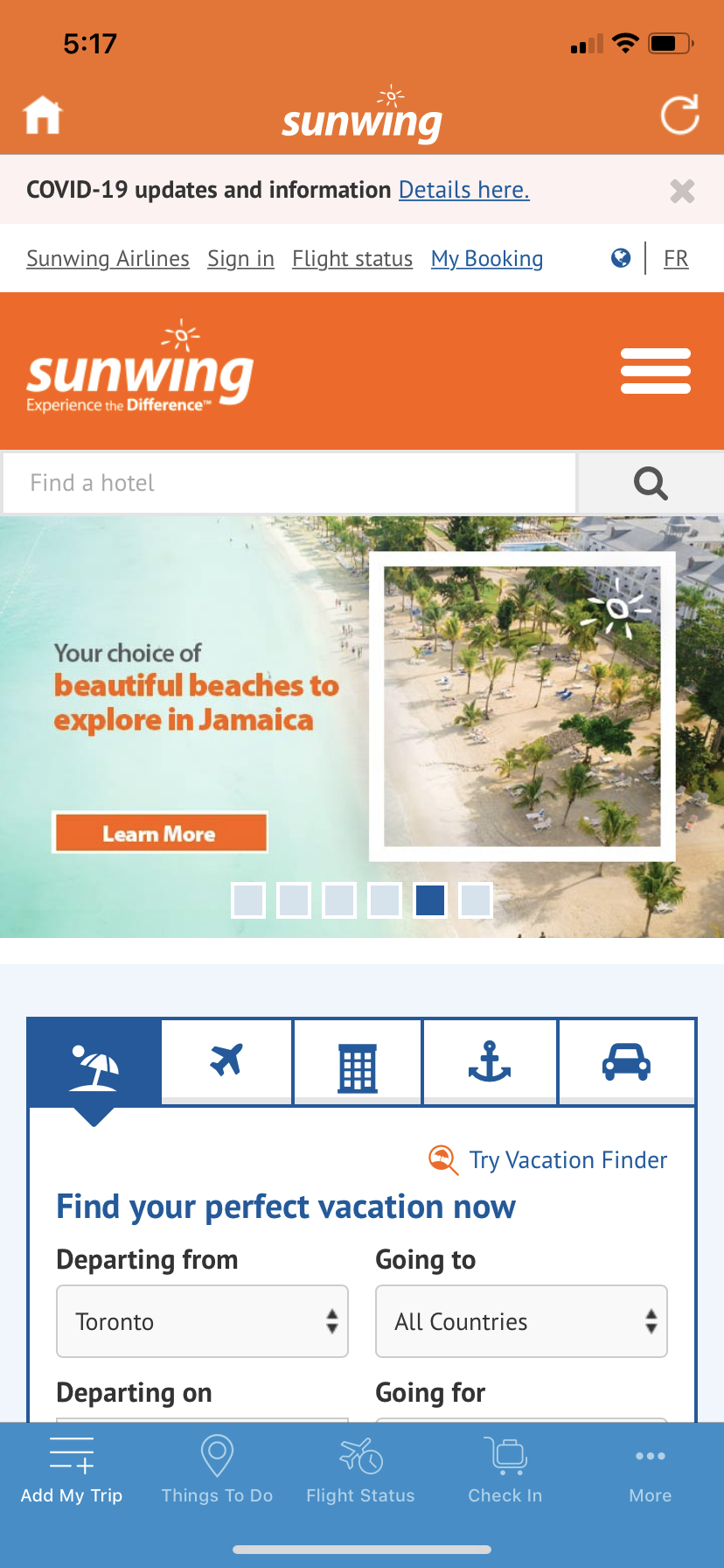
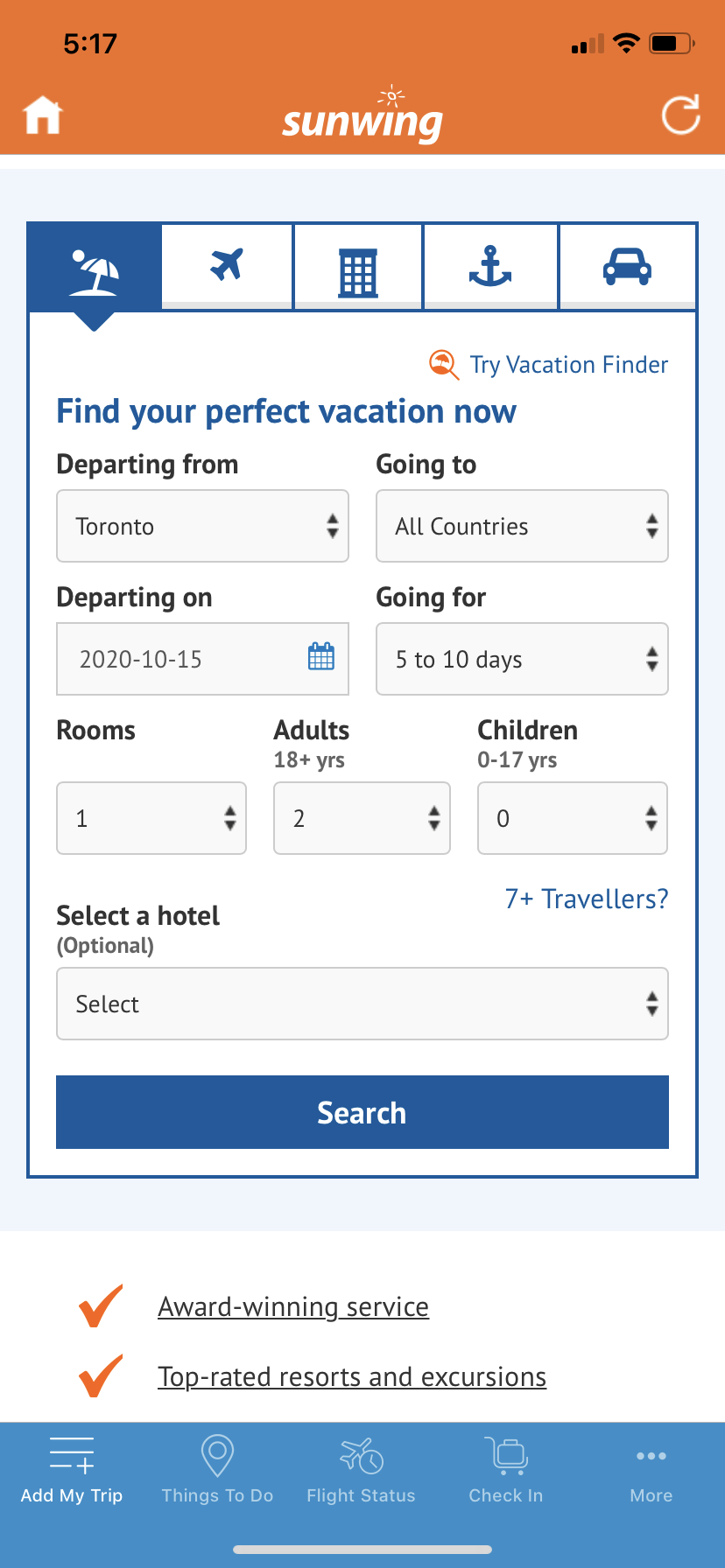
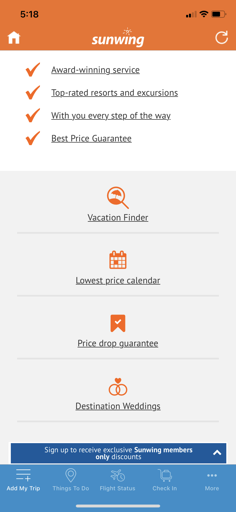
The old app design was pulling webview content for several pages. In order to make the app function better for users needs we wanted to make it ‘Home Screen’ centric. In doing so, page clutter has been reduced, which could cause users to have decision fatigue and ultimately end up deleting the app. Below are 3 screens that show the old app design.
Old App Design
Solution
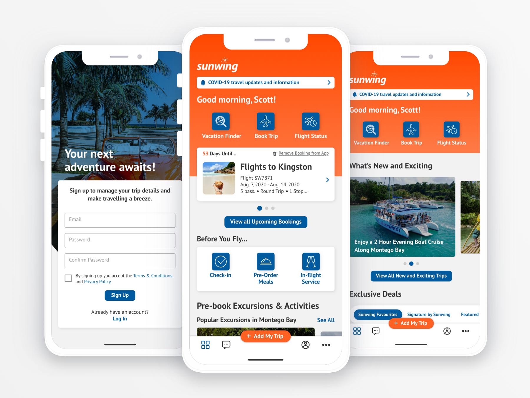
In the updated design everything is accessible from the homescreen or a click or two away. The tab bar now functions as a courtesy nav for users. The main links for Vacation Finder, Book Flight and Flight Status now appear as links in the top section of the home screen and would open modals with the respective content. The page content has been re-organized and designed in a way that it is dynamic based on where the user is at in their pre/post trip planning.
App Redesign
