
Building a custom experience for the Ontario Cannabis Store
OCS – Ontario Cannabis Store is Ontario’s trusted, legal online retailer/wholesaler of cannabis. Prior to cannabis legalization in Canada in October 2018, provinces across the country were creating their online presence for go-live. The OCS website is a fully custom build, that since launch has grown to include thousands of products and educational resources.
As the Lead Designer on OCS, Justine has been a part of the team since launch, she worked with project managers, developers, graphic designers, and other internal teams to create a best-in-class experience for OCS’s customers.
Prior to launch of OCS.ca wires were divided up among myself and one other UX/UI Designer. Since 2019 Justine has been the primary designer making updates to the UX and UI. The following is the latest work to go-live on OCS: PLP and PLP cards, colour system and graphic direction for PLP banners, store locator enhancements, search re-design, and the OCS Beginners’ Guide, also included is the PDP.
Client
OCS - Ontario Cannabis Store
Project Date
2017 - 2023
Category
Design · UX/UI Design · Web
PLP Redesign
The updated PLP was designed and implemented in 2020. With the redesign it was important to group like elements and create a product card that would contain information and make it easier to scan and compare. A ‘Price Drop Only’ toggle was added to allow for more immediate filtering. Toggles were repositioned to the right alongside ‘Sort’ on desktop and directly below ‘Filters’ and ‘Sort’ on mobile.
Through OCS’s research findings, users mainly used four top filters: THC, CBD, Plant Type and Size. The top four were positioned in a filter strip below the hero banner to allow for quicker access and then all additional filters were added within a ‘See More’ link.
Most recently Justine created a wayfinding system that uses OCS’s colour palette to define the top level categories. She also provided direction for the PLP banner background graphic, which has added more visual interest to the page.
Designs for the 2018 and 2019 PLP are also included to show the evolution.
PLP Mobile Redesign

PLP Desktop Redesign

PLP Desktop – 2019

PLP Mobile – 2018

PLP Desktop – 2018

PLP Desktop – Dried Flower Filter – 2018 and 2019

The updated PLP was designed and implemented in 2020. With the redesign it was important to group like elements and create a product card that would contain information and make it easier to scan and compare. A ‘Price Drop Only’ toggle was added to allow for more immediate filtering. Toggles were repositioned to the right alongside ‘Sort’ on desktop and directly below ‘Filters’ and ‘Sort’ on mobile.
Through OCS’s research findings, users mainly used four top filters: THC, CBD, Plant Type and Size. The top four were positioned in a filter strip below the hero banner to allow for quicker access and then all additional filters were added within a ‘See More’ link.
Most recently Justine created a wayfinding system that uses OCS’s colour palette to define the top level categories. She also provided direction for the PLP banner background graphic, which has added more visual interest to the page.
Designs for the 2018 and 2019 PLP are also included to show the evolution.
PLP Mobile Redesign
PLP Desktop Redesign
PLP Desktop – 2019
PLP Mobile – 2018
PLP Desktop – 2018
PLP Desktop – Dried Flower Filter – 2018 and 2019
PLP Card Redesign
Justine created the UX/UI for the card on the left and the final card on the right was a combination of hers and one other UX/UI Designer. Justine wanted to show a different way of adding to bag; on-click of a variant the bag icon would display indicating to a user they could then click it and add to bag. She chose to use a radio button for the ‘Compare’ option to indicate a user has selected a product.
After conducting user testing on the card variations both internally and externally the team had a better idea of what worked and what didn’t. The results of user testing indicated that people wanted to see the THC and CBD ranges displayed in a more visual manner. By doing this we were able to provide an easier comparison across cards on the PLP. With the new card design information has a clear hierarchy and is broken out into appropriate sections.
Final 2 Cards – UI Design

Justine created the card on the left and the final card on the right was a combination of hers and one other designer. Justine wanted to show a different way of adding to bag; on-click of a variant the bag icon would display indicating to a user they could then click it and add to bag. She chose to use a radio button for the ‘Compare’ option to indicate a user has selected a product.
After conducting user testing on the card variations both internally and externally the team had a better idea of what worked and what didn’t. The results of user testing indicated that people wanted to see the THC and CBD ranges displayed in a more visual manner. By doing this we were able to provide an easier comparison across cards on the PLP. With the new card design information has a clear hierarchy and is broken out into appropriate sections.
Final 2 Cards – UI Design
Store Locator Enhancements
The Store Locator needed a few UX/UI enhancements which included: updating the store pins appearance and size to accommodate more characters, enlarging the maps for easier viewing and findability, as well as slight updates to the type setting for location cards. A 1km distance filter was added to show users stores in their immediate vicinity, without having to zoom out.
The default search behaviour was updated in order to always display three results. If a search query doesn’t return exact results the intended behaviour is to show the closest three stores.
Note: Badging appearing on cards is conceptual and doesn’t currently exist on the live site.
Store Locator Enhancements – Mobile

Store Locator Enhancements – Desktop

The Store Locator needed a few UX/UI enhancements which included: updating the store pins appearance and size to accommodate more characters, enlarging the maps for easier viewing and findability, as well as slight updates to the type setting for location cards. A 1km distance filter was added to show users stores in their immediate vicinity, without having to zoom out.
The default search behaviour was updated in order to always display three results. If a search query doesn’t return exact results the intended behaviour is to show the three closest stores.
Note: Badging appearing on cards is conceptual and doesn’t currently exist on the live site.
Store Locator Enhancements – Mobile
Store Locator Enhancements – Desktop
Search Redesign
On-site search was redesigned to improve the overall experience for customers; making it more intuitive and consistent across all devices.
The search icon was made more prominent by adding a white circular background with a shadow, in keeping with the more recent material design aesthetic.
On-click of the search icon a user is presented with a new ‘Trending’ section within the search flyout. This provides users with quick access to products experiencing a surge in popularity.
Within the search flyout supporting images have been added providing more clarity for products with ambiguous titles. There have also been slight updates to the size of text and layout to make discoverability as frictionless as possible. By swapping the order of the ‘Articles’ and ‘Products’ sections, ‘Articles’ is now secondary, placing more emphasis on products.
Search Redesign Mobile

Search Redesign Desktop


On-site search was redesigned to improve the overall experience for customers; making it more intuitive and consistent across all devices.
The search icon was made more prominent by adding a white circular background with a shadow, in keeping with the more recent material design aesthetic.
On-click of the search icon a user is presented with a new ‘Trending’ section within the search flyout. This provides users with quick access to products experiencing a surge in popularity.
Within the search flyout supporting images have been added providing more clarity for products with ambiguous titles. There have also been slight updates to the size of text and layout to make discoverability as frictionless as possible. By swapping the order of the ‘Articles’ and ‘Products’ sections, ‘Articles’ is now secondary, placing more emphasis on products.
Search Redesign Mobile
Search Redesign Desktop
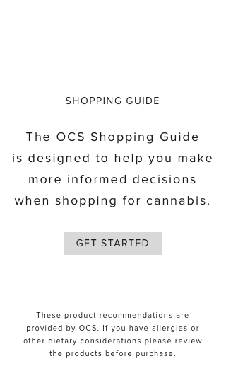
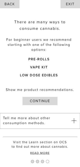
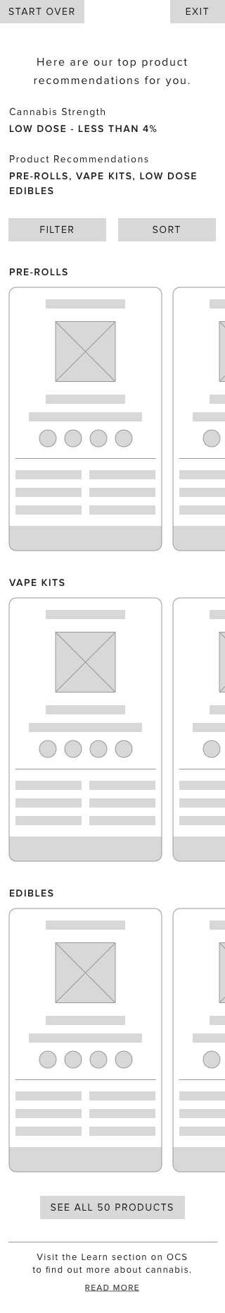
OCS Beginners’ Guide
The OCS Beginners’ Guide was launched in 2022, as an MVP solution. With a focus on novice users who need more assistance finding products. Phase 2 could include a more custom build.
The guide has helped OCS learn more about their customer base and what they want, while still allowing all types of users to try it out. Looking ahead a more advanced guide could include additional attributes that would provide a more optimal experience for all users.
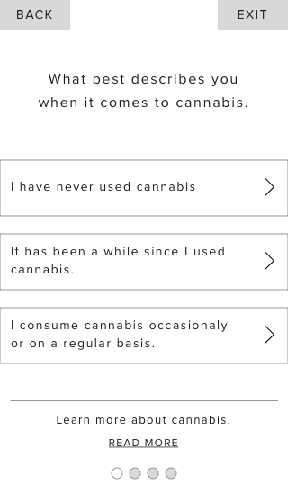
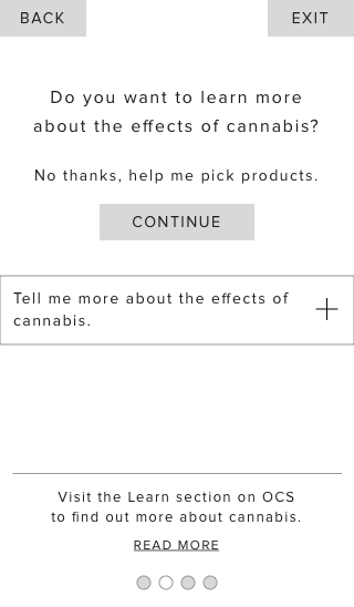
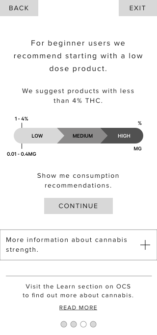
For this project Justine created and iterated on several versions of flow charts (shown here is final version 7), built a prototype in Typeform, lead user testing which involved the following: creating test documentation, conducting 1:1 moderated sessions with internal stakeholders, creating user scenarios, and coordinating with the Consumer Insights team on survey preparation.
Try Out the OCS Beginners’ Guide
Final Flow Chart – Live Guide

Wireframe Ideation Novice User – Custom Guide
Copy within the wireframes below is placeholder only and was not provided by OCS.
The OCS Beginners’ Guide was launched in 2022, as an MVP solution. With a focus on novice users who need more assistance finding products. For this project Justine initially created wires for the novice consumer. Due to internal resource issues we had to resort to using a 3rd party company to build out the basic survey as an MVP solution. Phase 2 would include a more custom build.
The guide has helped OCS learn more about their customer base and what they want, while still allowing all types of users to try it out. Looking ahead a more advanced guide could include additional attributes that would provide a more optimal experience for all users.
For this MVP solution Justine created and iterated on several versions of flow charts (shown here is final version 7), built a prototype in Typeform, lead user testing which involved the following: creating test documentation, conducting 1:1 moderated sessions with internal stakeholders, creating user scenarios, and coordinating with the Consumer Insights team on survey preparation.
Try Out the OCS Beginners’ Guide
Final Flow Chart – Live Guide
Wireframe Ideation Novice User – Custom Guide
Copy within the wireframes below is placeholder only and was not provided by OCS.
Current PDP
Justine worked alongside another UX Designer on the design for the PDP in 2018. The design is simple and minimalist; sections are well defined and ordered in a hierarchal format according to most important. Above the fold, a two column approach was taken to juxtaposed important, at-a-glance attributes and the product image carousel.
Initially, on launch the focus was more on educating users, which is why the section ‘How Do I Use This Safely?’ was added (image 3, PDP Prior to launch – 2018). Since launch additional attributes have been added, accessibility issues have been resolved and certain content has been removed.
The design has stood the test of time, but as new attributes come into play and the need for more information arises the PDP should evolve accordingly.
Current PDP Mobile – Since 2018
Current PDP Desktop – Since 2018
PDP Prior to Launch – 2018

Justine worked alongside another UX/UI Designer on the PDP in 2018. The design is simple and minimalist; sections are well defined and ordered in a hierarchal format according to most important. Above the fold, a two column approach was taken to juxtaposed important, at-a-glance attributes and the product image carousel.
Initially, on launch the focus was more on educating users, which is why the section ‘How Do I Use This Safely?’ was added (image 3, PDP Prior to launch – 2018). Since launch additional attributes have been added, accessibility issues have been resolved and certain content has been removed.
The design has stood the test of time, but as new attributes come into play and the need for more information arises the PDP should evolve accordingly.
Current PDP Mobile – Since 2018
Current PDP Desktop – Since 2018
PDP Prior to Launch – 2018